 FastToChart
Convert Pie & Donut Charts from Images
Pie and donut charts are standard visuals for displaying market share, budget splits, and portfolio allocations. FastToChart extracts slice proportions, category labels, center hole metrics, and custom slice colors from flat images, transforming them into live PowerPoint presentation slides and clean Excel tables.
Upload chartHow it works
- 1Upload or paste your pie chart, donut graph, or presentation slide image.
- 2The AI vision model measures radial angles, reads printed percentages, and matches legend keys to slice colors.
- 3Review the slice values in the interactive table and export a native PowerPoint chart or Excel workbook.
A chart you can work with
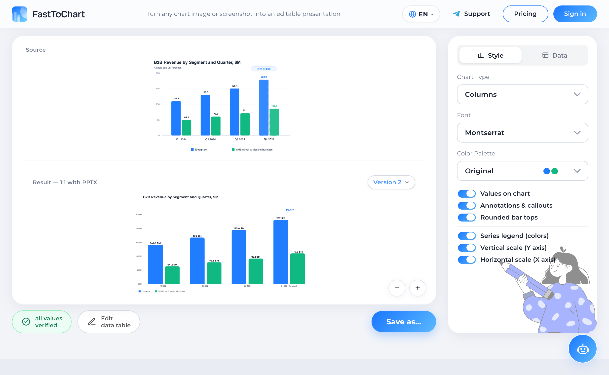
Verify extracted values, update numbers, and customize styling in a unified editor.
- Data table alongside your chart
- Colors and labels under your control
- Editable presentation-ready files
Understanding the Chart and Structure
A pie chart visualizes relative part-to-whole relationships, where the entire 360-degree circle represents 100% and individual slices indicate constituent category contributions. Donut charts feature an open central core, widely used in modern dashboards and executive presentations to house key summary totals, currency badges, or primary headline figures.
These circular graphics dominate competitive benchmarking, portfolio allocation overviews, and survey results. However, human visual perception is notoriously poor at judging relative angular areas, making accurate manual transcription from unlabelled pie slices nearly impossible without digital extraction.
Anatomy and Key Components
FastToChart reconstructs circular visualizations by identifying all primary geometric and semantic attributes:
Why Manual Extraction Fails
Rebuilding a pie chart from a screenshot by hand is one of the most frustrating tasks in slide design. Trying to recreate slices using arbitrary PowerPoint shape arcs never aligns cleanly, while manually guessing percentages from wedges without printed numbers almost always results in slice totals that fail to sum to 100%.
If you retype estimated numbers into Excel to build a fresh chart, tiny miscalculations shift the sequence of wedges, making your new slide noticeably inconsistent with the source report. FastToChart calculates precise angular arcs, normalizes slice percentages, and generates native Office chart objects where each slice remains fully editable by colleagues.
Data Verification Best Practices
Open the verification table to review the extracted slice inventory. Slices extracted from explicit printed numbers are marked as verified with full confidence.
If an image lacks printed numbers, verify that the measured angular shares match your business expectations, and inspect small 'Other' tail categories before exporting.
Frequently Asked Questions
Printed numbers are copied verbatim to preserve historical report fidelity. When numbers are absent, FastToChart normalizes measured angles to total exactly 100%.
Try it on your chart
Upload an image, presentation, or PDF — the first three recognitions are free, and editing data or exporting files is never metered.
Open tool