 FastToChart
Convert Funnel Charts and Conversion Pipelines from Images
Sales pipelines, recruitment workflows, and marketing acquisition funnels illustrate stage-by-stage operational efficiency. FastToChart converts static funnel screenshots into clean spreadsheets and editable presentation slides, extracting stage volumes, drop-off percentages, and step sequences automatically.
Upload chartHow it works
- 1Upload your sales pipeline screenshot, marketing funnel graphic, or slide image.
- 2FastToChart identifies stage names, visitor counts, stage-to-stage conversion rates, and color gradients.
- 3Inspect the funnel sequence in the data table and download an editable PowerPoint slide or CSV table.
A chart you can work with
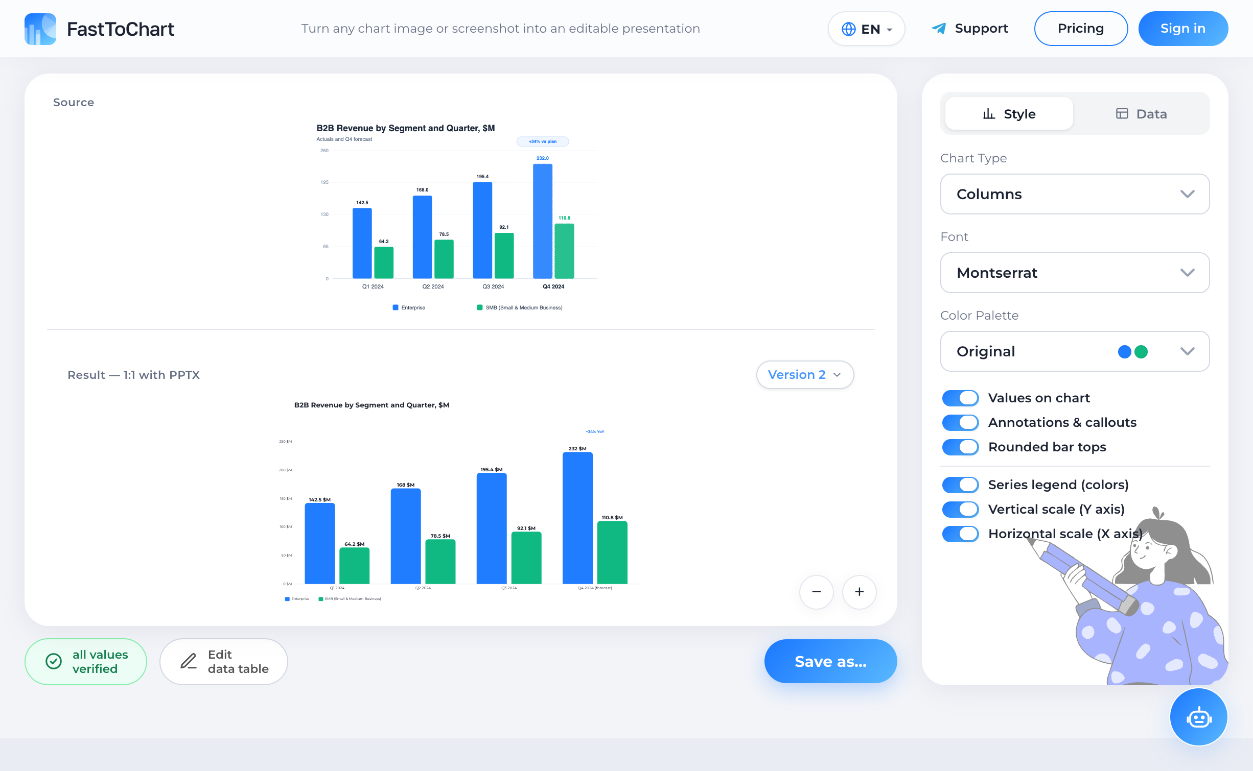
Verify extracted values, update numbers, and customize styling in a unified editor.
- Data table alongside your chart
- Colors and labels under your control
- Editable presentation-ready files
Understanding the Chart and Structure
Funnel charts visualize sequential linear workflows where items or users drop off across defined progressive stages. Typical applications include B2B sales pipelines (Leads → Qualified Prospects → Proposals → Closed Won), e-commerce checkout funnels (Product Views → Cart Adds → Checkout → Purchase), and customer onboarding journeys.
Because the visual area narrows from top to bottom, funnel graphics effectively communicate process attrition and pinpoint organizational bottlenecks where the greatest customer drop-off occurs.
Anatomy and Key Components
Every funnel visualization features a predictable flow architecture that FastToChart parses and reconstructs:
Why Manual Extraction Fails
Rebuilding a funnel graphic by hand in PowerPoint typically involves drawing stacked trapezoid shapes or adjusting awkward polygon points. This approach produces a static drawing: if monthly metrics change or a new stage is introduced, the entire shape cluster must be manually redrawn, realigned, and recolored.
Furthermore, calculating conversion percentages and drop-off rates across multiple stages by hand often leads to formula mistakes. FastToChart extracts both absolute headcounts and derived conversion ratios into a clean table and outputs clean vector slide objects that you can update instantly for monthly business reviews.
Data Verification Best Practices
Frequently Asked Questions
Yes. Our deep vision model inspects high-density labels placed inside or beside narrow stages, extracting exact numbers even when spacing is tight.
Try it on your chart
Upload an image, presentation, or PDF — the first three recognitions are free, and editing data or exporting files is never metered.
Open tool