 FastToChart
Convert Bar Charts and Histograms from Images
Bar and column charts form the bedrock of business intelligence and financial reporting. FastToChart reads vertical columns, horizontal bars, multi-series clusters, and frequency histograms directly from static screenshots, turning flat raster images into live PowerPoint presentation objects and clean Excel spreadsheets.
Upload chartHow it works
- 1Upload or paste your bar chart screenshot, presentation slide, or PDF report page.
- 2The vision engine extracts bar heights, series groupings, category labels, error bars, and color palettes.
- 3Review the extracted values in the interactive data table and download an editable PowerPoint (.pptx) or Excel (.xlsx) file.
A chart you can work with
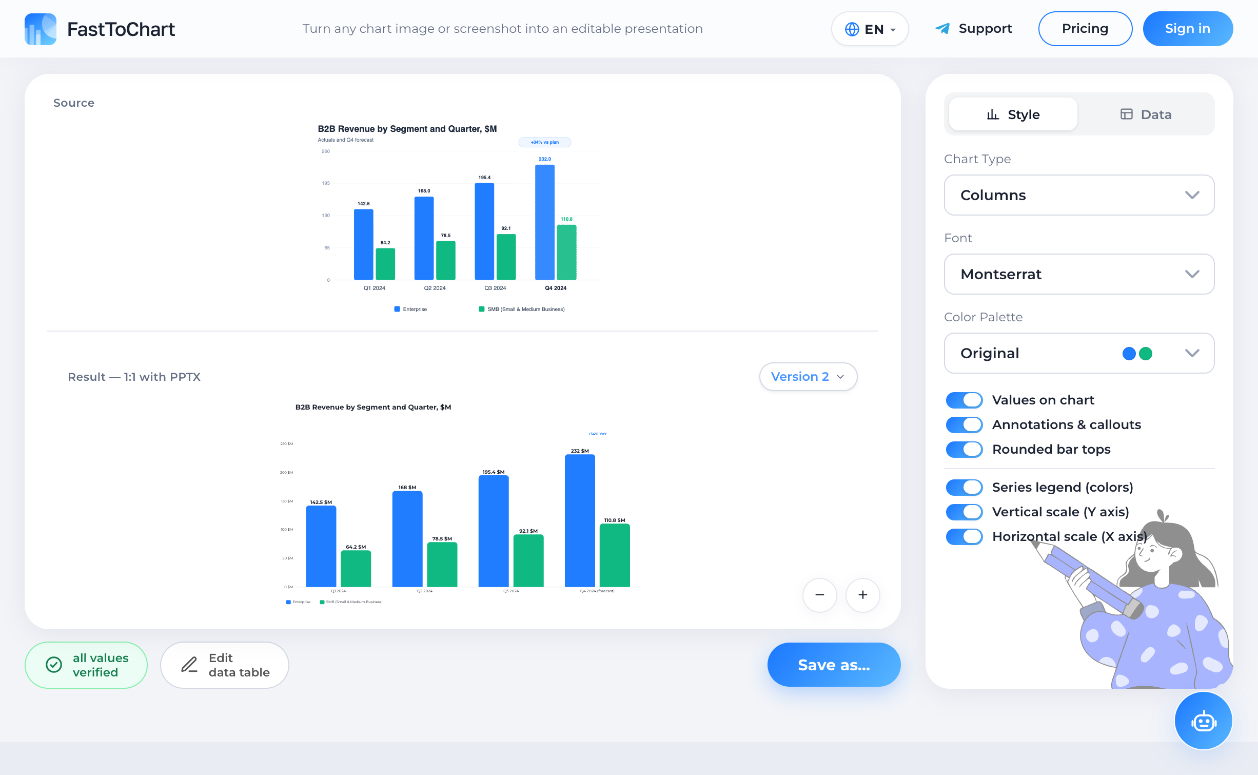
Verify extracted values, update numbers, and customize styling in a unified editor.
- Data table alongside your chart
- Colors and labels under your control
- Editable presentation-ready files
Understanding the Chart and Structure
Bar charts and column graphs display discrete categorical metrics using rectangular bars whose heights or lengths correspond proportionally to their quantitative values. Vertical column graphs are ideal for time-series progressions and financial periods, while horizontal bar charts accommodate lengthy department titles, survey statements, and competitive ranking leaderboards without label collision.
Histograms, in comparison, map continuous numerical frequency distributions partitioned across equal intervals or bins. Extracting histograms requires reading both the continuous bin boundary thresholds along the horizontal X-axis and the accurate frequency density counts on the vertical Y-axis.
Anatomy and Key Components
FastToChart decomposes every column and bar graphic into its core geometric and structural components:
Why Manual Extraction Fails
Manually retyping data from a bar chart image is laborious and prone to severe estimation error. When exact numbers are not printed directly on bars, analysts resort to eyeballing tick marks or holding digital rulers against screen pixels. In multi-series stacked columns, small measurement discrepancies compound, producing segment totals that contradict published report conclusions.
Drawing approximate rectangle shapes in PowerPoint produces brittle visual drawings that lack underlying data sheets, fail to recalculate when numbers change, and distort upon resizing. FastToChart measures bar geometry against calibrated axis scales and generates native Office Open XML (OOXML) charts backed by true Excel workbooks.
Data Verification Best Practices
Before downloading your presentation or spreadsheet, inspect the interactive data verification table in the editor. Each cell features color-coded confidence indicators: green for verified printed text, yellow for geometric axis interpolations, and red for occluded values.
You can click any table cell to modify numbers, rename series labels, toggle rounded bar caps, or switch between vertical column and horizontal bar orientations in a single click.
Frequently Asked Questions
FastToChart calculates bar values against the calibrated Y-axis scale and flags them with confidence tags so you can quickly inspect and verify them.
Try it on your chart
Upload an image, presentation, or PDF — the first three recognitions are free, and editing data or exporting files is never metered.
Open tool